Free Quadrant Maker for Fast Analysis Charts
Learn how quadrant charts turn complex tradeoffs into clear visuals, and when frameworks like Eisenhower or BCG help teams compare priorities fast.
Quadrants are popular for one reason: they make a messy discussion visible.
Instead of debating a long list item by item, you place each item on a two-axis grid and see the shape of the problem. What is high effort and high impact? What is urgent but low value? Which competitor is cheap but weak, or premium but strong?
That shift from list to map is what makes quadrant charts useful in product, strategy, planning, and presentations.
What a quadrant maker actually helps you do
A quadrant maker helps you:
- compare many items quickly,
- spot clusters and gaps,
- explain priorities to other people,
- and turn abstract conversations into something concrete.
The goal is not to make a perfect chart. The goal is to make a decision easier to discuss.
Common quadrant frameworks
Here are a few formats people reach for again and again:
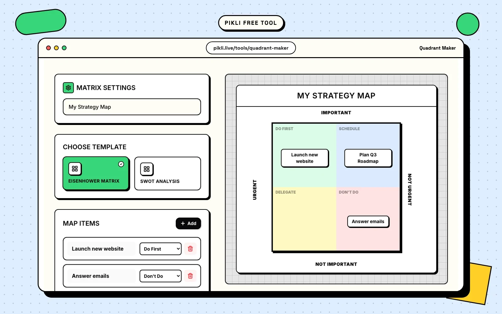
Urgent vs important
Useful for task prioritization. It separates immediate noise from work that actually matters.
Effort vs impact
Useful for roadmaps and backlog reviews. It shows what deserves immediate focus, what needs planning, and what is not worth the effort right now.
Risk vs reward
Useful for bets, experiments, investments, and strategic choices where uncertainty matters.
Positioning maps
Useful when comparing brands, products, features, or markets. These help teams talk about where they are now and where they want to move.
How to build a quadrant people can actually use
The biggest mistake is being vague. If the axes are fuzzy, the chart will be fuzzy too.
Start with:
- A clear horizontal axis.
- A clear vertical axis.
- A short list of items to place on the chart.
- A reason each item belongs where it sits.
Then review the outliers. The points furthest from the middle are often the most useful conversation starters because they expose obvious action or obvious caution.
Why this format works well in teams
Quadrants make tradeoffs easier to explain in meetings. Instead of saying “this feels more important,” you can show where the item sits and why. That reduces circular conversation and gives people something concrete to challenge or refine.
They also travel well. A clean chart can be reused in a deck, shared in chat, or exported for follow-up without losing the core message.
Use a matrix poll when you want live input
The Quadrant Maker is best when you want a clean chart to think with, discuss, or export.
A Matrix Poll solves a different problem. Use it when you want participants to place themselves, ideas, or priorities directly on a 2x2 during a live session.
That works well for questions like:
- Which tasks feel high effort and high impact?
- Which risks feel likely and severe?
- Which ideas matter most and feel easiest to try?
Use the Matrix Poll to collect the live signal, then use the Quadrant Maker when you want a polished version to share afterward.
Try Pikli’s free Quadrant Maker
If you want to turn a rough list into something you can present or discuss immediately, try the Quadrant Maker. It is free to use, easy to adjust, and built for quick exports when the chart is ready to share.
Quadrants will not make the decision for you, but they will make the conversation sharper.
Free to use on Pikli
Try Pikli's free Quadrant Maker
Map ideas, priorities, or positioning on a clean chart you can share immediately.
Want people to place ideas on a live 2x2 instead? Create a Matrix Poll .
Continue exploring
Related guides
Go deeper with practical articles selected from the same topic cluster.
Pros & Cons Matrix for Tough Choices
Stop making overwhelming decisions by guesswork. Learn how a visual pros and cons matrix brings clarity to complex choices and reduces decision anxiety.
Read article → 02Random Choice Picker for Fair Decisions
Overcome decision paralysis with a fair, fun random choice picker tool. Learn why your brain fights simple choices and how randomness can help.
Read article → 03Free Tier Maker for Shareable Visual Rankings
Tier lists turn opinions into visuals people can scan, challenge, and share. Learn when a tier maker works best and how to pair it with Pikli for live input.
Read article → 04Top X Generator for Fast Visual Rankings
Create professional visual rankings instantly with our free Top X generator. Perfect for social media, presentations, and content marketing.
Read article →